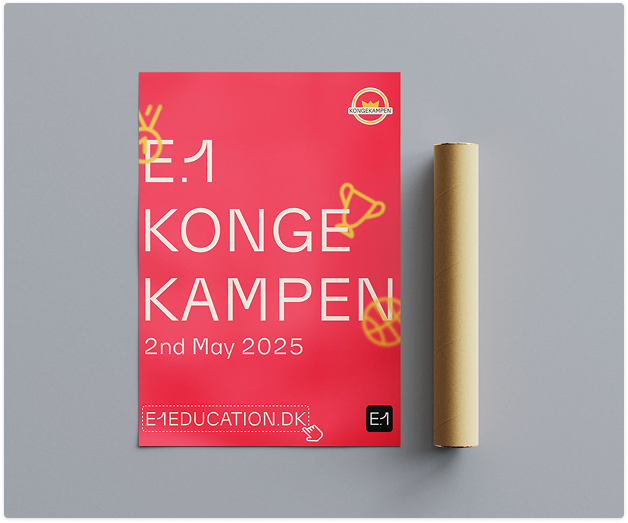
Championship Red:
Reimagining Kongekampen
Every year, the city of Esbjerg transforms. Textbooks are traded for dodgeballs, and quiet campuses erupt into a sea of costumes and competition. This is Kongekampen—the definitive social event for students at SDU, AAU, UC Syd, SEA, FMS, and SDMK.
We undertook the challenge of rebranding Kongekampen to bridge the visual gap between its inherently chaotic "student rowdiness" and the professional backing of Education Esbjerg (E.1).
01.The Case for Change
The legacy branding was a relic of its time, relying on harsh gradients, chaotic sunbursts, and cluttered layouts. It felt like a "party flyer" identity operating in a high-profile "city festival" reality. The redesign aimed to craft a visual system that is:
Scalable
High-impact execution across all touchpoints, from a business card to a massive bus shelter.
Social-First
Uncompromising legibility and dynamic vibrancy on a 6-inch mobile screen.
Unified
A cohesive partnership visual language natively integrating the E.1 corporate brand.
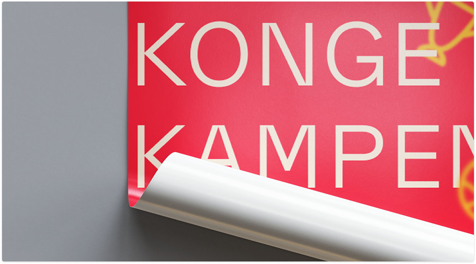
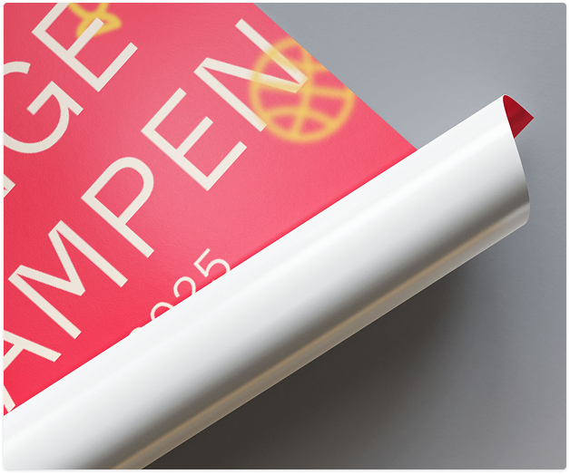
02.The "Power" Palette
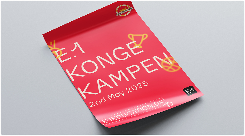
The rebrand is anchored by Championship Red (#FF2442). It’s a color that demands an adrenaline spike—the visual equivalent of a dodgeball whistle echoing across the court.
Primary
The Heartbeat. Action, intensity, and fierce competition.
Royal Gold
The Prize. A definitive nod to the titular "Konge" (King).
Soft Cream
The Sophisticate. Soft contrast ensuring premium readability.
Brand Blue
The Partner. Integrating the E.1 corporate identity seamlessly.
By swapping out harsh default whites for the inviting #FFEDDA Cream, the brand immediately establishes an intentional, premium tone that elevates the photography and typography.
03.Digital Dynamics
A student event lives and dies on social media algorithms. The new social suite is engineered to slice through the feed. Using glowing iconography—trophies, basketballs, glowing crowns—the layouts capture "motion blur" and the frantic energy of tournament day, even in static formats.
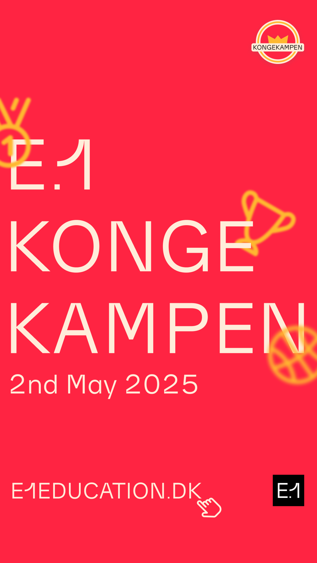
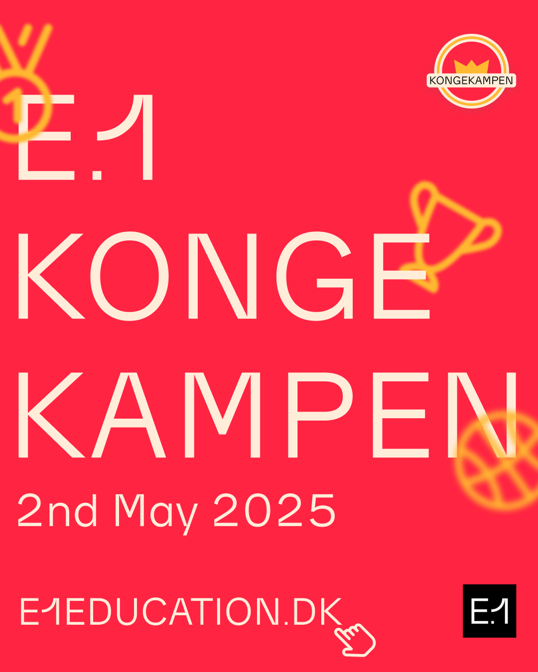
Feed Takeovers
Striking type scaling and high-contrast composition make every update feel like a major, adrenaline-fueled announcement.
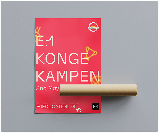
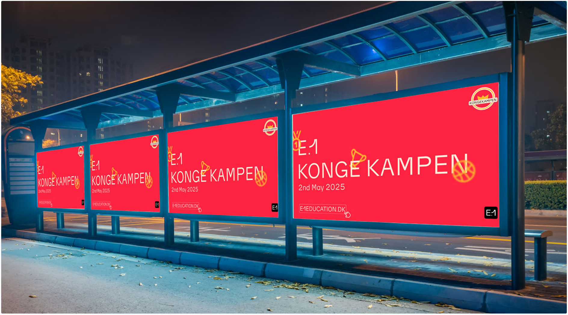
04.The Urban Takeover
A true city-wide event must own the physical environment. The visual identity translates brilliantly to large-scale OOH displays, creating heavy-hitting awareness across Esbjerg's urban landscape. Let it be digital screens on public transport, or tactical print assets—the consistency remains unshakeable.
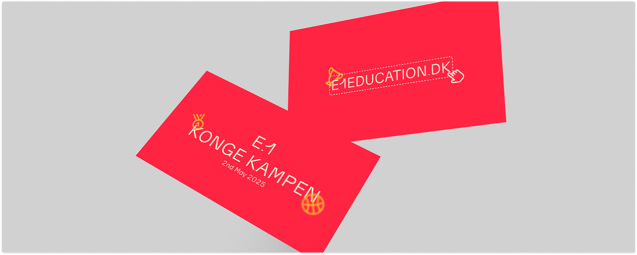
Networking for Champions
Even the smallest touchpoints carry massive weight. VIP networking cards utilized the heavy "Championship" red and dynamic typography to ensure the organizers left an enduring mark on sponsors and partners.
05. The Result
Kongekampen now holds a visual toolkit that matches its immense legacy. It walks the tightrope of royal pride and competitive, underground grit—an unstoppable brand defining Esbjerg's ultimate student tradition.
"Rebranding isn't just about picking a new color;
it’s about crafting a banner that a community is immensely proud to run under."